
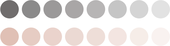
Imagine for a moment if the world was in black and white. It wouldn’t have been half as intriguing as it is with its plethora of colors. The variety in colors lends uniqueness to our life.
For years, marketers have also used color psychology successfully for brand promotions.
Research has established the impact of color psychology on human behavior. In a recent university study, researchers found a strong link between a calm mood and preference for the color blue, among other findings.

That’s why choosing the right colors for the rooms in your house can affect your living to a great extent.
Let’s learn about different color schemes, types of colors, and how to choose the best colors for each room.
Color Wheel and Color Schemes


Sir Isaac Newton
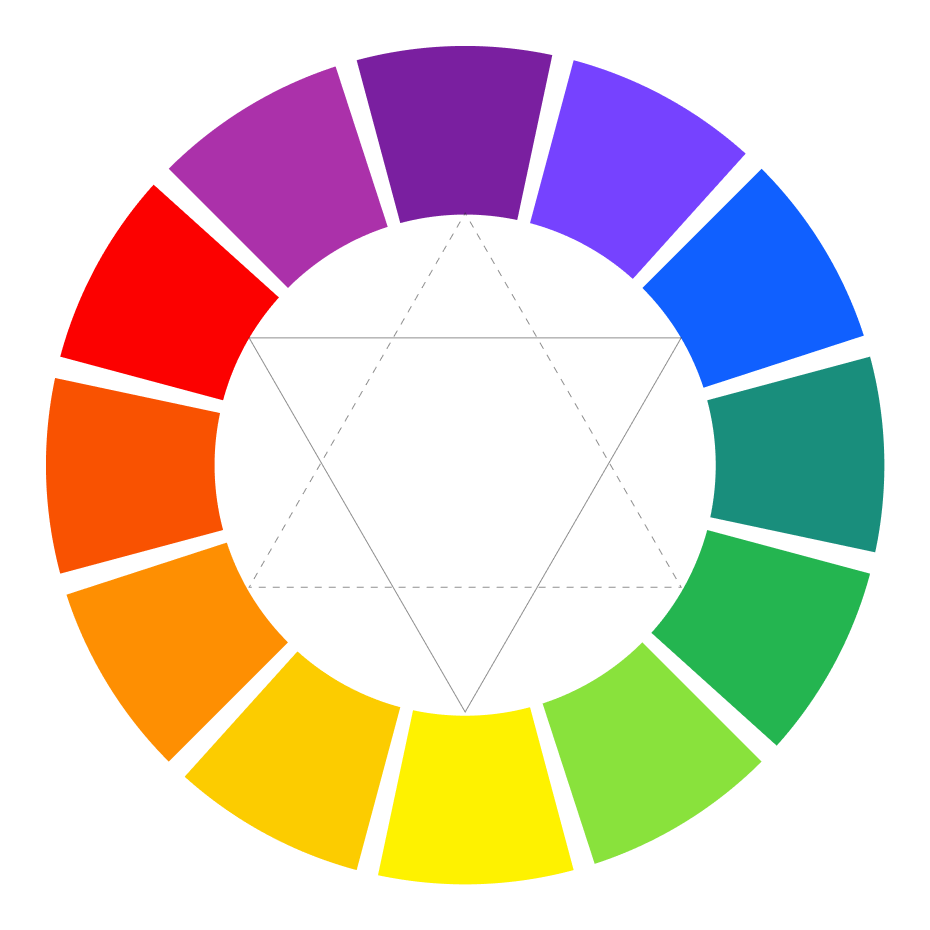
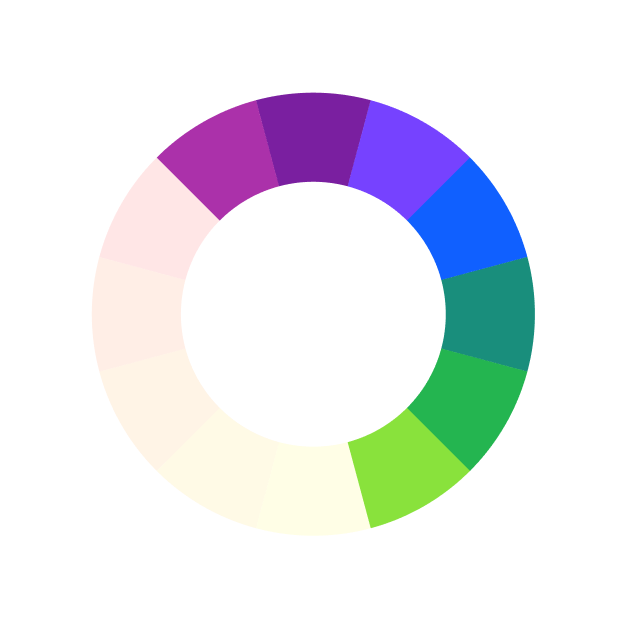
Invented in 1666 by Sir Isaac Newton, the color wheel is a combination of science and art. It shows relationships between the colors, which you can use to see how different wall colors for room relate to each other.
color wheel
As per the wheel, red, blue, and yellow are primary colors, using which you can create secondary colors that are orange, green, and purple. You can use secondary colors to create six different types of tertiary colors.
According to the basic color theory, there are three different color schemes.
PRIMARY COLORS

RED

YELLOW

BLUE
secondary colors

ORANGE

GREEN

PURPLE
Complementary Color
Scheme
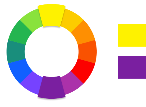
The opposite colors on the color wheel are called complementary colors, which form the complementary color scheme. These are red-green, yellow-purple, and blue-orange. This color scheme creates maximum contrast.
Analogous Color
Scheme
The colors next to each other on the color wheel are called analogous colors or harmonious colors that form an analogous color scheme. Common analogous color scheme examples are blue – teal (blue + green) – green and red – vermillion (red + orange) – orange.

Monochromatic Color
Scheme
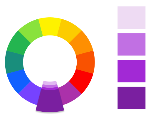
A monochromatic color scheme comprises variations or shades of a single color. You can add black or white color to any other color to create different shades of it.
Color
Moods Associated With Them and Choosing the Best Color for Your Room
As you have now understood the different color schemes, let’s see how different interior paint colors can affect your mood.
Classification of Colors
Based on Their Effect on
Mood
Based on their effect on the mood, there are three types of colors, including neutral, warm, and cool colors. Here’s how they affect your mood.

Warm Colors
As these colors are reminiscent of fire or sun, they are called warm colors. As interior paint colors, they can have a stimulating effect.

It is a vibrant color that is said to evoke intense emotions. It is also the boldest and most passionate color of all.

As it is bright, this color quickly grabs attention. It is an energetic color but can also cause frustration and anger.

Orange is often associated with excitement, enthusiasm, cheerfulness, and warmth as it reminds you of sunny days.
Cool Colors
Cool colors have a soothing and calm effect. So, they are the best paint colors for a calming effect in a room.

It offers a calming and relaxing effect. It slows down respiration and heart rate, making it more suitable for bedrooms and bathrooms.

It is the most restful color for your eyes. Suitable for almost any room, it stimulates feelings of warmth and togetherness.

As it is rich, dramatic, and sophisticated, purple is often associated with luxury. It is suitable for living rooms and bedrooms.

Neutrals
Neutral colors typically include black, gray, white, and brown. However, white and black are the primary ones.

It is often associated with luxury and sophistication. You can use it sparingly to add depth to a room’s color scheme.

Although different cultures associate different emotions with white color, it is often considered a symbol of purity, cleanliness, and peacefulness. It is a favorite for painting ceilings.
How to Choose the Best
Color for Your Room?
As you can see, different colors have different psychological effects on you. That’s why it is necessary to put careful thought into selecting the best color to paint a room.
Here are a few general interior paint color recommendations for different rooms in your house.
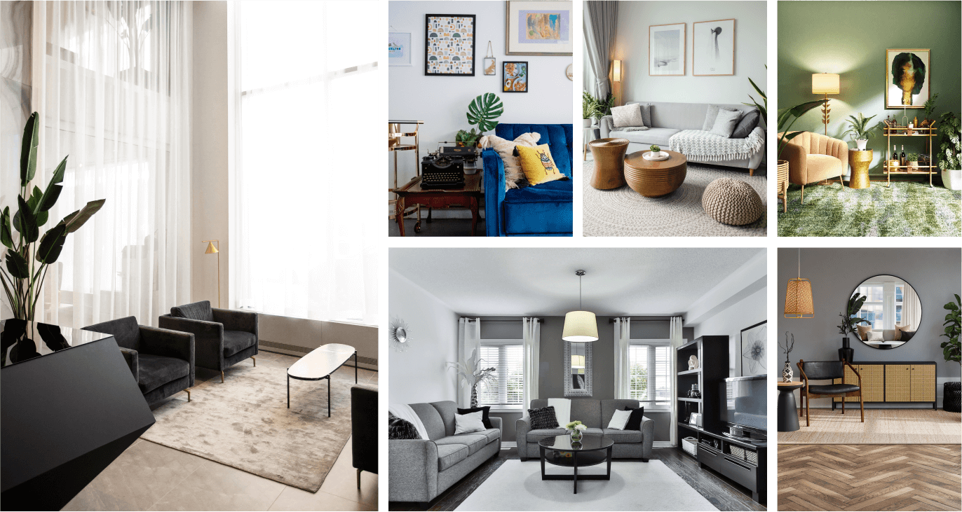
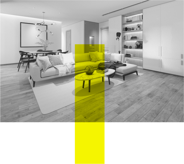
Living Room
The living room is an area that your guests will see first. It is also the most common area of your house where everyone, including your family members, comes together. As a result,
Mood
As people come together in the living room, it needs to have a color combination that promotes warmth and togetherness. At the same time, it also needs to make a statement as your guests will visit the living room first.
Choosing Best Color for Living Room
When it comes to living rooms, a neutral background is often the preferred choice as it allows your furniture and art to stand out. Popular paint colors for living rooms include black, beige, dove gray, white, and maroon.

If your living room gets plenty of sunlight, dark black color can add a sense of opulence to it. It also grants an unexpectedly dramatic look to your living room.
Beige, on the other hand, lends a sense of simplicity with elegance. The minimalist look it offers is attention-grabbing. Subtle shades of beige are a must for a classy, yet minimalist look. You can use darker colors like maroon and burgundy for a luxurious appeal.
You can also use different shades of blue for a calming and stabilizing effect. However, sometimes, it may tone down the energy levels a little too much. You can also use variations of green for living room wall colors to create a tranquil and peaceful effect.
colors to avoid
Although you can use other warm living room paint colors, avoid using red, especially bright red color. Bright red color has a highly stimulating effect, which may prevent you from relaxing. Also, avoid using bright yellow color as it can lead to eye fatigue and stimulate anger and frustration.
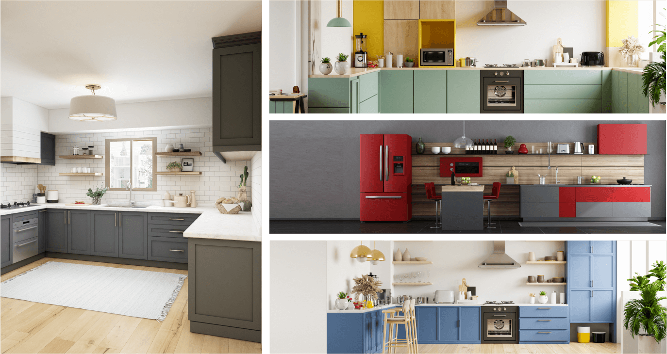
Kitchen
The kitchen is where you do the cooking and dishwashing. It is perhaps one of the most accessorized rooms in your house with cabinets, chimney, cooking table, countertop, and appliances. So, you need to think about the color ideas for kitchen accordingly.
Mood
As you get a lot of chores done in the kitchen, the energy level here needs to be very high.
These high energy levels will make your carefully executed spreads and cooking sessions more enjoyable.
Choosing Best Color for kitchen
You can use warm paint colors for a kitchen such as light orange and red as they help stimulate your appetite. So, enjoying a shared meal over an animated family conversation comes easily with this color choice.
You can also use light yellow color to let some sunshine into your kitchen to brighten things up. Yellow is also known to activate metabolism and boost thinking. It is an excellent option for small kitchens, where you may like to have a cheerful atmosphere.

If you like subtle colors, you can use lighter shades of blue to paint the walls, cabinets, and even the ceiling. However, you need to use them sparingly to avoid an overwhelming effect.
Neutrals like white, brown, and gray are also popular kitchen paint colors. Gray, for example, can pair with a wide range of color combinations. You can also use it to paint kitchen countertops and cabinet doors.
colors to avoid
When it comes to kitchens, you should most certainly avoid using black, dark blue, and bright yellow colors. Dark colors can bring down the energy levels in the kitchen, making you feel lethargic or even depressed.
Dining Room
The dining room is the heart of a house that connects to every other room. It is also the place where your family has meals together.
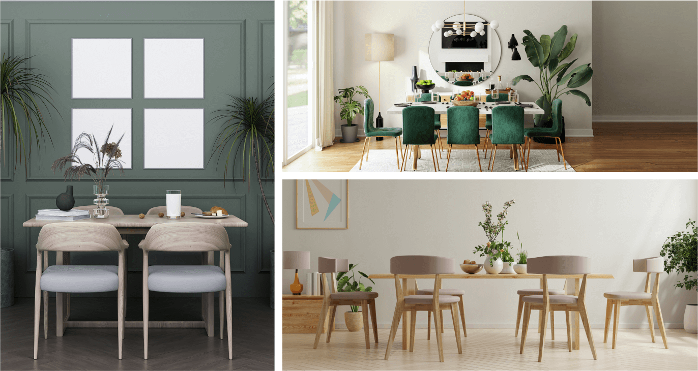
Mood
When thinking about dining room color ideas, keep in mind that you need colors that will cheer you up. Like in the kitchen, the color should also stimulate your appetite and metabolism.
Choosing Best Color for Living Room
With the right shades of red, you can invite liveliness and social interaction into your dining room. It will also increase your appetite. Maroon and red wine colors are your best bet.
You can use pastel yellow color as it creates a feeling of warmth, which can help kickstart your metabolism. Subdued orange is also one of the best dining room wall color ideas with a similar effect on your mood.
If you want to add freshness to the dining room, try different shades of green. Green makes you feel closer to nature, and it is also a soothing color for the eyes. It can offer a cozy, relaxed, and happy atmosphere for eating your everyday meals.

colors to avoid
While you can go for rich and bold colors and even earthy tones, you need to avoid darker shades like deep grey and brown or black. These color combinations are likely to suppress your appetite and also make you feel depressed if your dining room has less natural light.
Study Room
The study room is where you or your kids read, do paperwork, and study. Having a calm and relaxing study room will help you perform these tasks better.
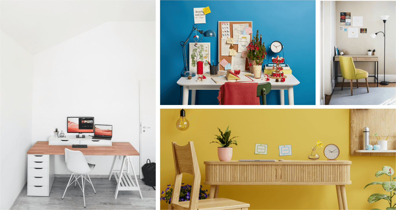
Mood
You need an energized, yet soothing atmosphere in the study room. It will help you concentrate on your work. You also need a color combination that helps get your creative juices flowing.
Choosing Best Color for Living Room
Blue is perhaps one of the best paint colors for a study room as it is associated with the sky. In many cultures, the sky represents imagination and creativity.

With the right shade of green, you can create a lively and cheerful study room. Green is very calming for your eyes, keeping them relaxed when studying. Moss green and sage are very suitable for a study room. These color combinations can help increase your productivity.
Red also draws your attention quickly and increases your blood pressure. This, in turn, can stop your children from dozing off.
However, too much red color can stimulate aggression. So, instead of using only red color, use a touch of red wine, maroon, and pastel red in your study room.
Yellow is also a cheerful color. It can lift your spirit and help you concentrate better on your work. However, excessive use of yellow color can lead to anxiety and even fear.
Orange is a mood-lifting color made from red and yellow. It is said to incite inspiration and positive vibes. It is also a color of fun. You can use light shades of orange to adorn your study’s walls. It can also go well with your study room furniture.
If you don’t want to go with a single color, you can try a combination of two or three of these colors to paint your study room. Avoid using more than three colors though as it can create a confusing feeling.
colors to avoid
While the right study room color ideas will keep your kid’s energy levels high, the wrong ones will have the exact opposite effect. In other words, you must never use darker shades of black, blue, and grey, especially for kid’s study room. If you want to go with a shade of blue, turquoise or cerulean may be the right one.
Bedroom
The bedroom is where you can relax and sleep. So, you need to choose bedroom color schemes that will help you unwind.
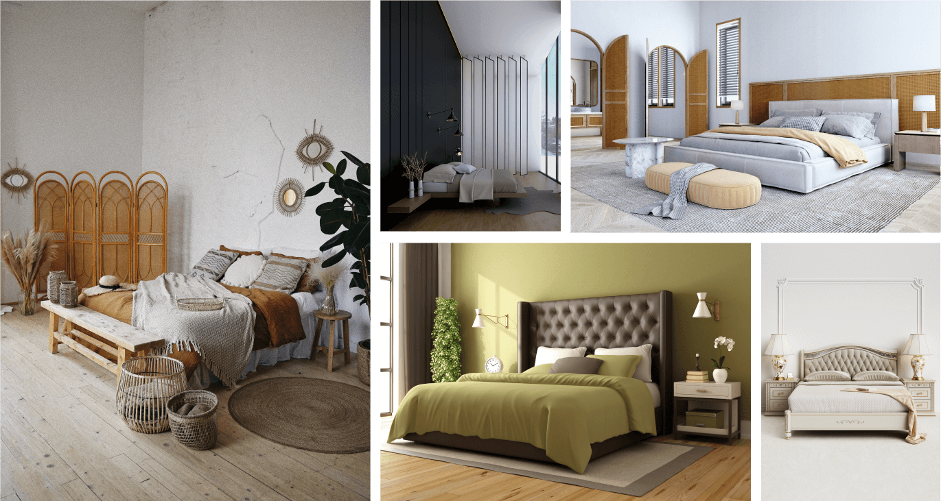
Mood
It is important to create a calm, relaxing, and de-stressing feeling in your bedroom. So, you need to bring your energy level down, or if your energy level is already down, you need to keep it that way.
Furthermore, couples may want their bedroom to radiate romantic vibes. After all, this is where they will enjoy their most intimate moments. So, you may need to take the romance factor into account when considering bedroom color combinations.
Choosing Best Color for Living Room
As it radiates a relaxing and calming effect, blue is one of the best colors for a bedroom. This color is known to lower your blood pressure and promote relaxation. For bedrooms with relatively low sunlight, you can go with a variety of pastel blue colors as they can create a soothing sleep environment.
Blues with a warmer underdone also have a cooling effect. If you live in a hot weather area, pastel blues are the best calm bedroom paint colors. However, if your bedroom also serves as a home office, you can go for a brighter shade of blue. It will make you feel more energetic when you sit to work.
Green is an excellent alternative to blue when it comes to bedroom colors. It is a naturally soothing color that relaxes your eyes. In many cultures, green is also a color of prosperity and fertility.
Soft shades of green can work wonders as an alternative to neutral color schemes for bedrooms. These shades are known to promote feelings of serenity and contentment.
To create more exciting bedroom color combinations, you can use light and dark shades of purple. However, use the dark tones sparingly.
Another extremely calming bedroom color is grey. It often facilitates a feeling of warm fuzziness, a much-needed mood in the bedroom. But, you should keep it soft and subtle. While darker grays can be dramatic, they can also be depressing. However, a blue-gray color can bring both warmth and coolness to your bedroom.
Pink is also an excellent choice for bedrooms, especially for girls. Research has shown that soft shades of pink can subdue aggressive behavior. The color also encourages playfulness. Just make sure to stick to lighter shades.
best bedroom color
White is also one of the best bedroom colors. It makes you feel fresh and invigorated. Another advantage of using a soft shade of white is that it feels energetic during the day and soothing at night. White walls can also make rustic furniture look less cluttered. You can also use shades of white in combination with light blue and green or even purple.
Colors to Avoid
When it comes to a bedroom, red is an intense color. This energetic color will prevent you from feeling relaxed and calm. You will struggle to sleep, especially if you are a light sleeper.
It may also lead to sexual overdrive, which might compromise your relationship. The bottom line is, avoid using it as far as possible. However, if you must use red, keep it limited to accents only.
Another color you should avoid using is orange. It is not one of the popular bedroom colors because it is highly stimulating. So, using it in the bedroom will prevent you from having a good night’s sleep. It is, however, alright if you go ahead with a softer shade of orange like peach, which has a soothing effect.
You should also avoid using dark brown color in bedrooms as it is often associated with dullness. Dullness is not the same as relaxation. That’s why this color is not suited for bedroom decor. Still, you can use a light brown color, if you must.
Yellow is another energizing color that you shouldn’t use in a bedroom. As it stimulates activity, it will prevent you from sleeping calmly, making it an unsuitable bedroom wall color.
Bathroom
The bathroom is the most personal space in your house. You need to think about how and when you use it while deciding color ideas for the bathroom.
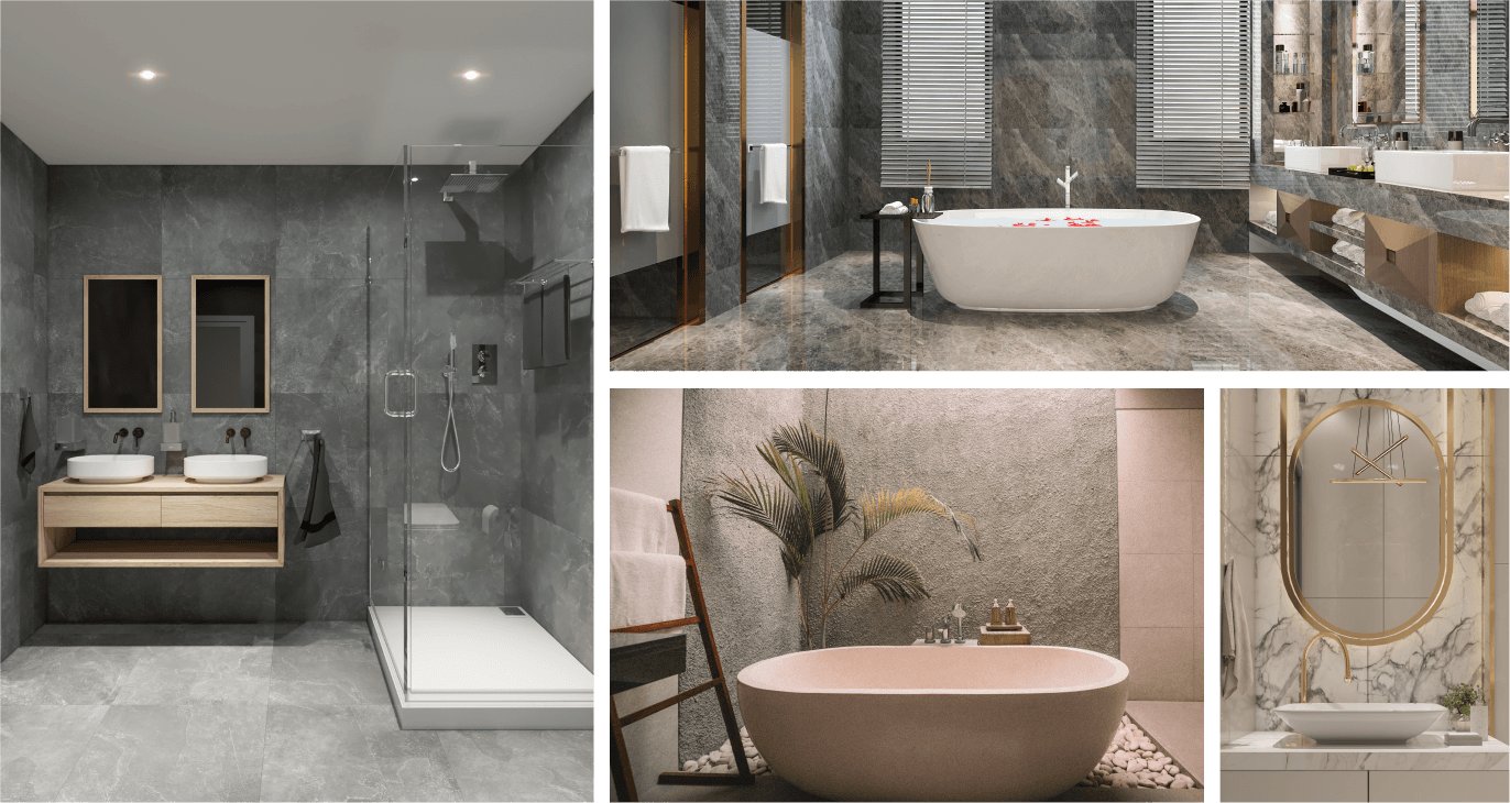
Mood
The mood in the bathroom will depend on your lifestyle. For example, some people like to take a quick shower while others prefer a spa-like space where they can relax and take a long bubble-bath. Think about how you use the bathroom before deciding the color scheme.
Choosing Best Color for Bathroom
Neutral colors like white, creamy white, beige, and soft grey are best suited for bathrooms as they represent purity, cleanness, and sophistication. However, you can use charcoal for a dramatic but relaxing look.
On the other hand, for a spa-like feeling, light blue shades are the best. Using bright blue shades like cerulean will make your bathroom look like a tropical beach.
Shades of light green will make you feel closer to nature and make a sunny bathroom feel cooler. They also go well with earthy hues like brown, taupe, and sand.
Colors to Avoid
Avoid using extremely bright colors such as red and neon. While colors like bold peach or dark orange will make your bathroom unappealing, tints like greenish-brown will dampen your mood. In short, avoid dark bathroom wall color ideas entirely.
Wrap Up
As you can see, considering the correlation between the colors and their effect on your mood will help you create a pleasant living space. With the right color palette, each one of your rooms will serve their purpose better.
Hopefully, the tips mentioned in this post will prove instrumental in this regard. So, which colors for rooms in a house do you have in mind? Tell us all about your color preference and room decor in the comments section.